Loading...
Getting things ready for you
Getting things ready for you
You did it! You found the portfolio website!! Jokes aside, I'd love to share some behind-the-scenes info on this project.
This app started development over a year ago, but truthfully, I've been wanting and meaning to build something like this for a long, long time. Between flitting through other projects and not really wanting to put in the effort into getting it on a production server, I wouldn't say it really took that many hours despite its long development timeline.
Its primary purpose was to be a learning project for Next.js with a separate backend API written in Golang. (Well, looking at my mockups, apparently I was considering Remix for a time!) Functionally, I wanted it to be a place I could put both my art and my writing—but then I realized I could also fulfill my desire to host and write a blog on the same platform as well. Importantly, I wanted to build my own CMS because I've worked with Wordpress and Drupal in the past and I knew I'd likely want something at least a little robust in order to make posts. I did not want to hardcode everything, in any case.
The dragon has been part of the "branding" since the beginning. Dragons are very quintessentially "me." I've loved dragons since at least kindergarten, based on some old pictures my mom kept! But I had a harder time deciding what to really go with. The "Bekah's Folio" logo actually predates this iteration of the app, and I liked the sleeping dragon on top, acting as the apostrophe. But since I'd expanded the function of the site to be more than just a showcase of my art and literature and applications, I went through a phase of trying to get a little more creative with it. I had really thought "Port Bekah" might be it: a shortening of "portfolio" while also acting as a sort of"port"—a place where people gather to see the goings-on.
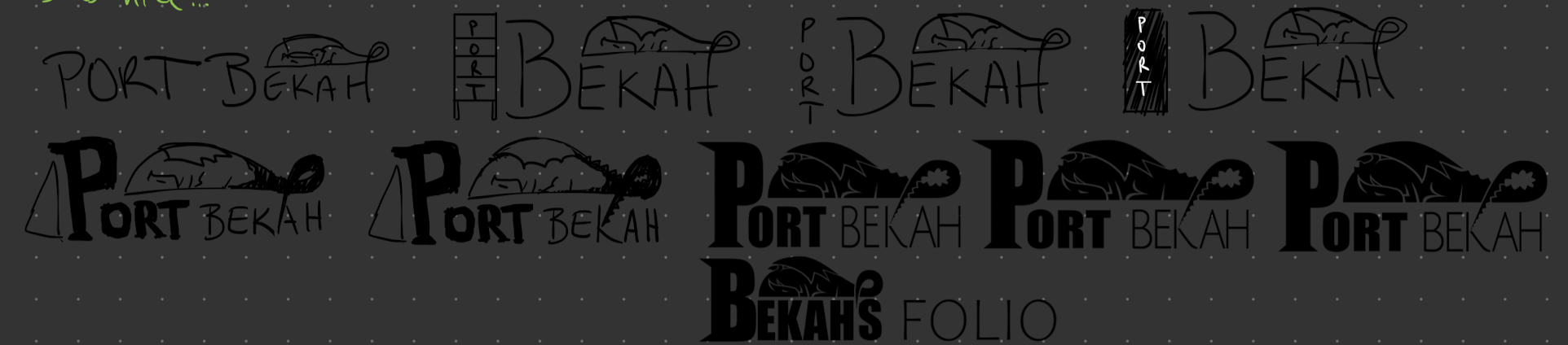
In the end, I just wasn't in love with it. I'd maybe still consider other options, but for now, it felt like Bekah's Folio was good enough to get the job done. The final logos were made in Inkscape as SVGs, which has allowed me to do some nice fun things with it!
Here's a mockup of the homepage. It's surprising how little has changed from that design, honestly. There are still some features here that I have yet to implement, but they'll also stay pretty close to the vision. There are still some differences here and there, of course.
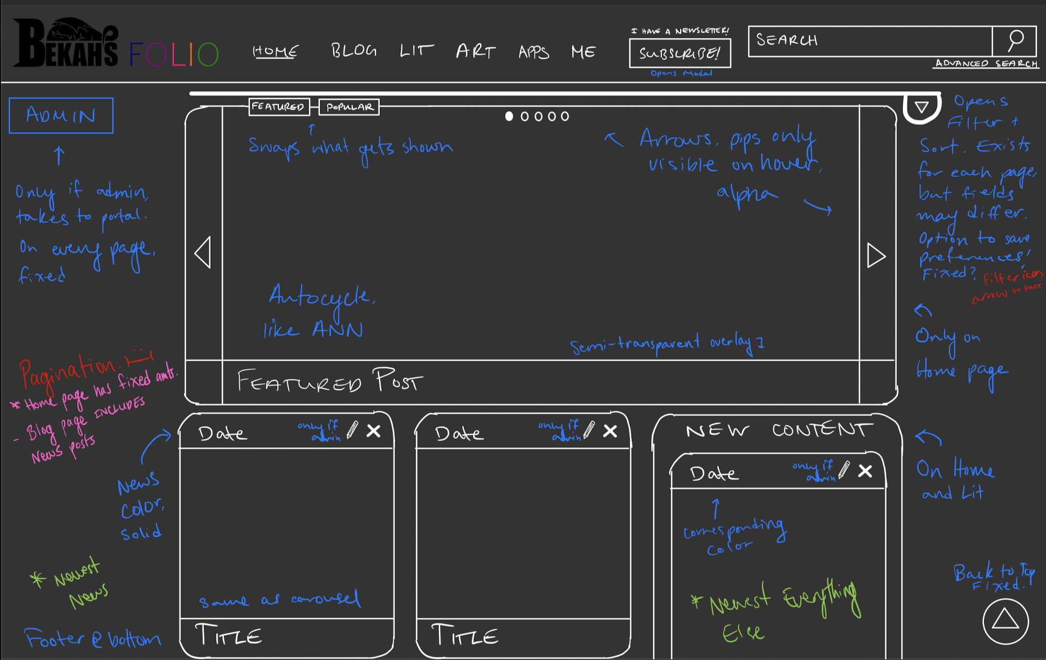
Admittedly, I started feeling like the site was far to dull. It really lacked a certain... je ne sais quoi that you wind up seeing in the fancy, avant garde Awwwards portfolio websites. "I want to be featured there someday," I thought. And maybe I could, but I don't think it'll ever be for this particular site. This app is a learning experience. It's a place I want people to come back to and not be visually overloaded by a million different filters and effects for a singular "wow" experience. Are there still areas to improve? Absolutely. Which is why I have a massive to-do list with a bunch of things to fix and add the various features that are currently missing. And that's okay. Because I finally got it out there, and that's what really matters!